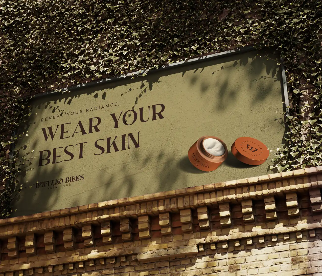
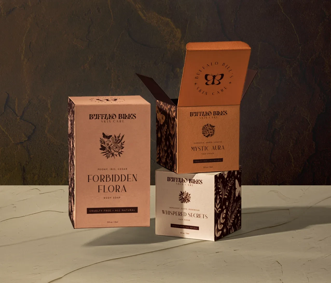
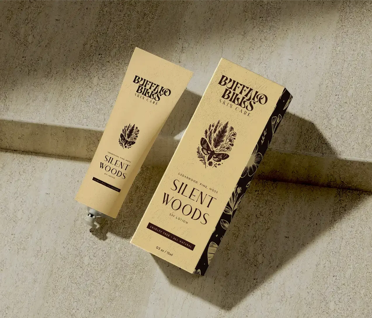

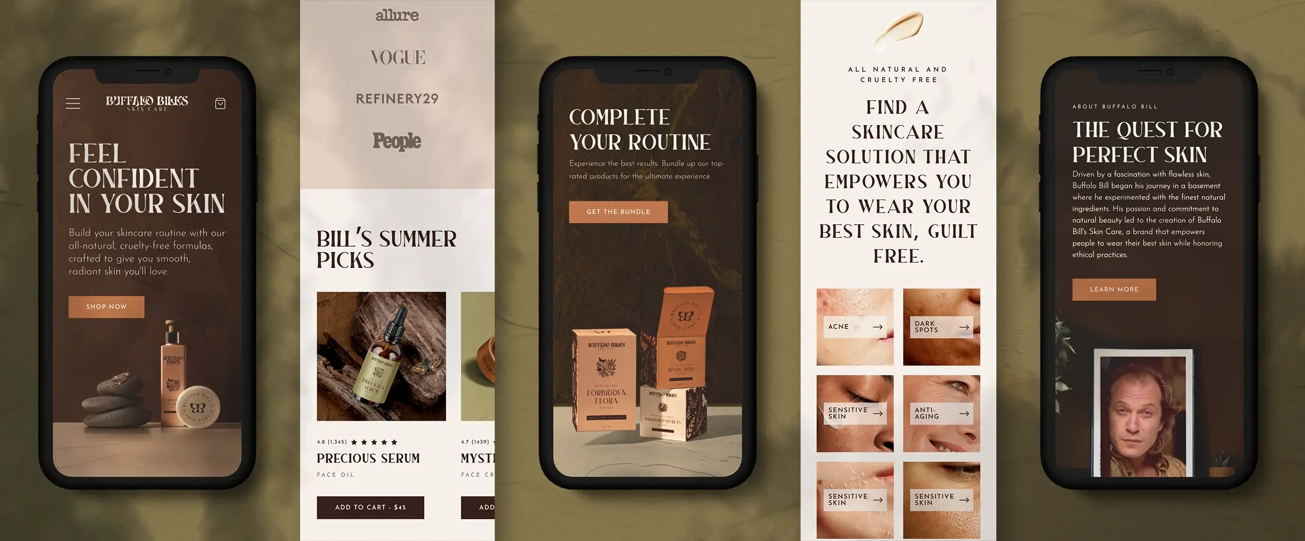
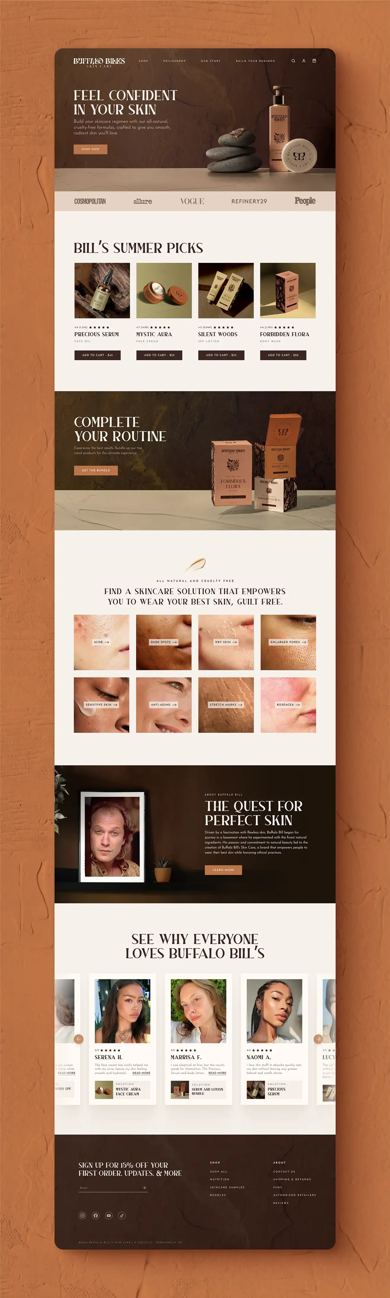
Buffalo Bill’s Skin Care is a natural skin care brand dedicated to helping people embrace their best skin while remaining cruelty free. Rooted in the belief that skincare should be both effective and ethically crafted, the brand focuses on high quality, all natural ingredients designed to nourish and transform the skin.
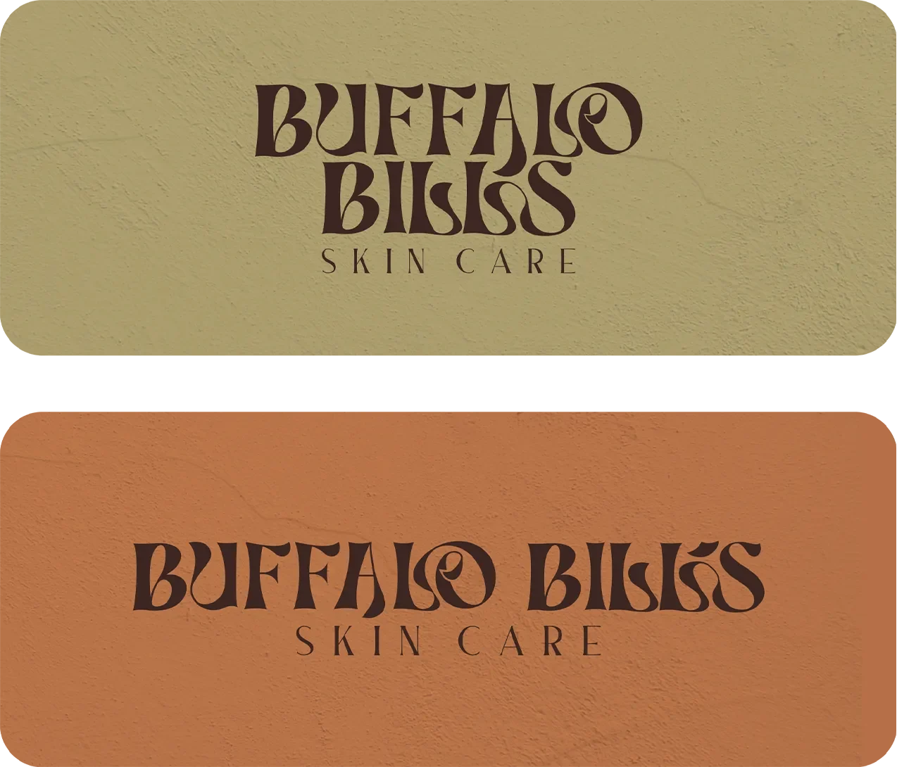
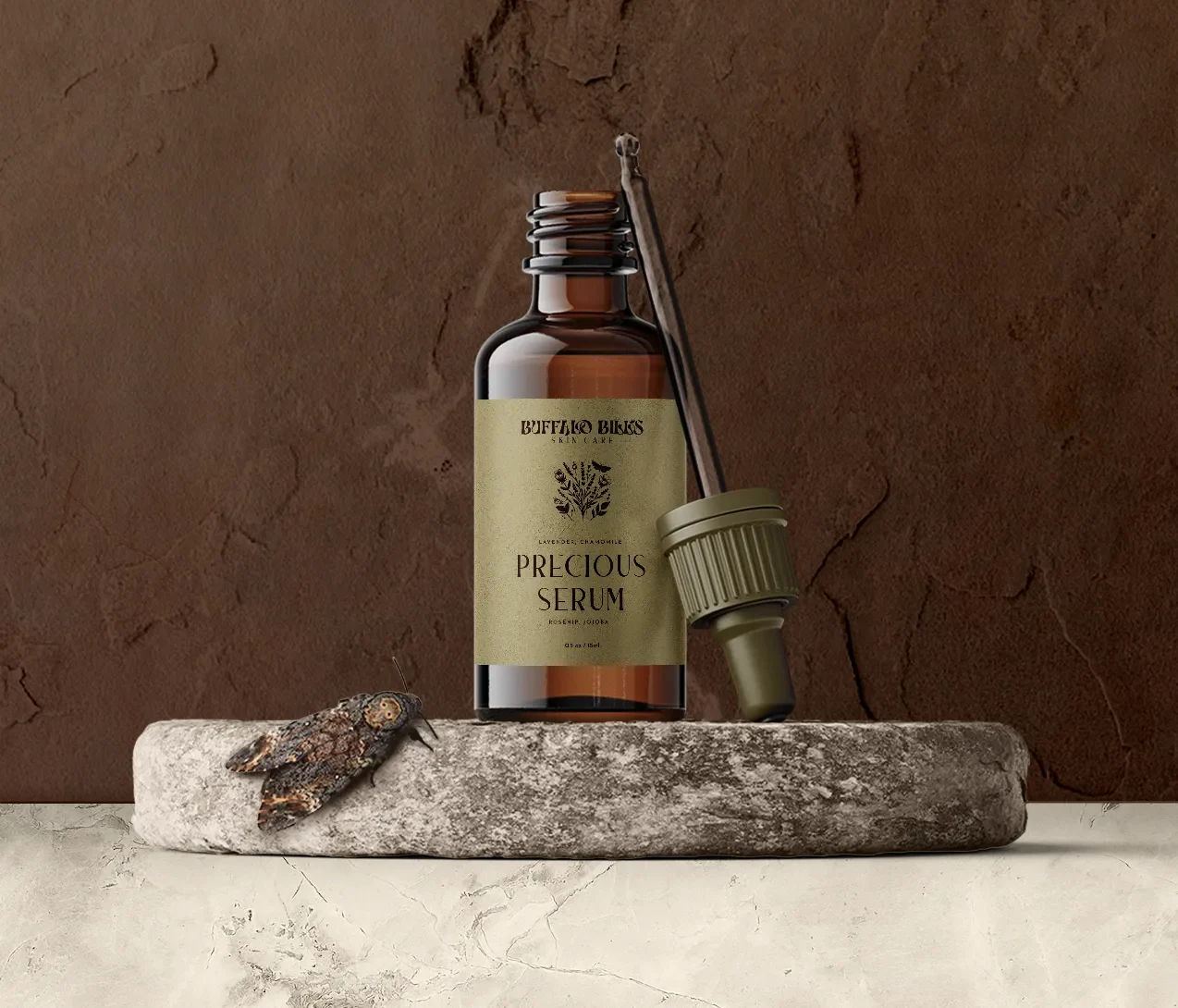
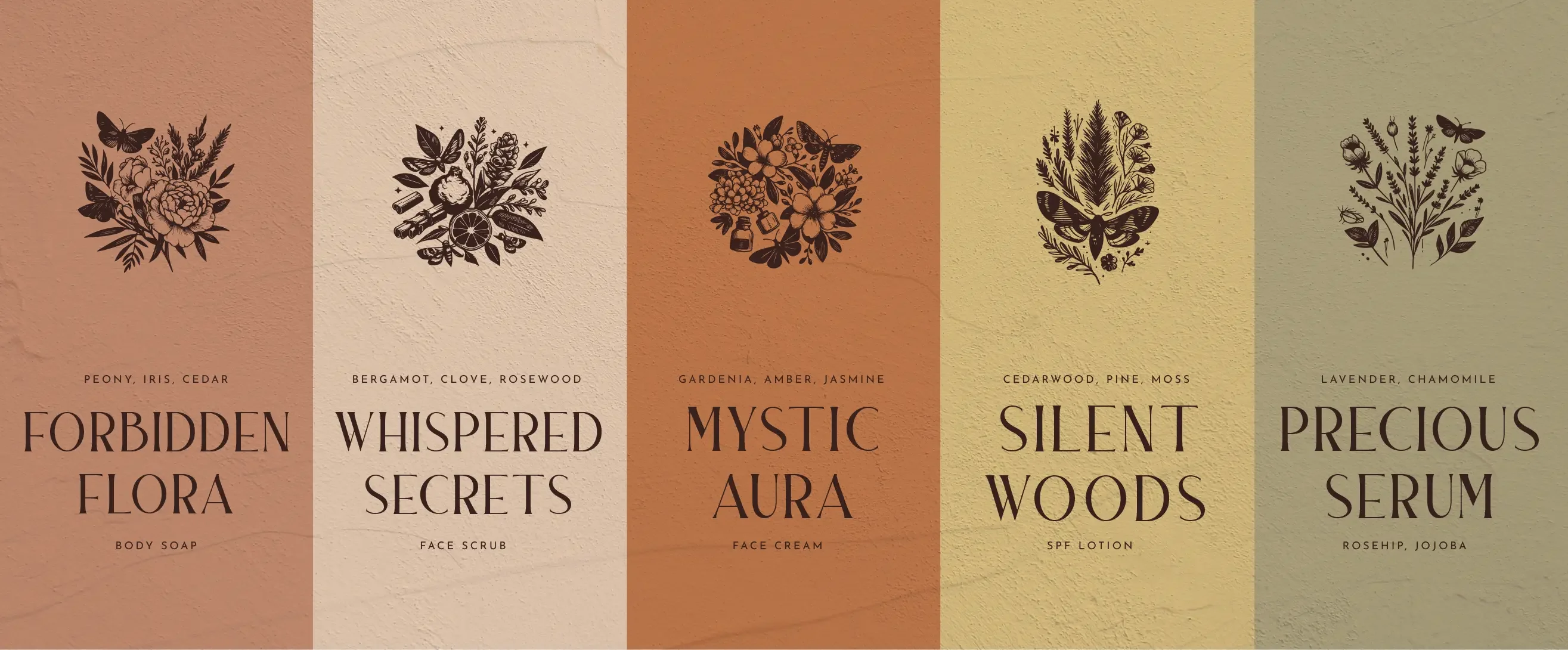
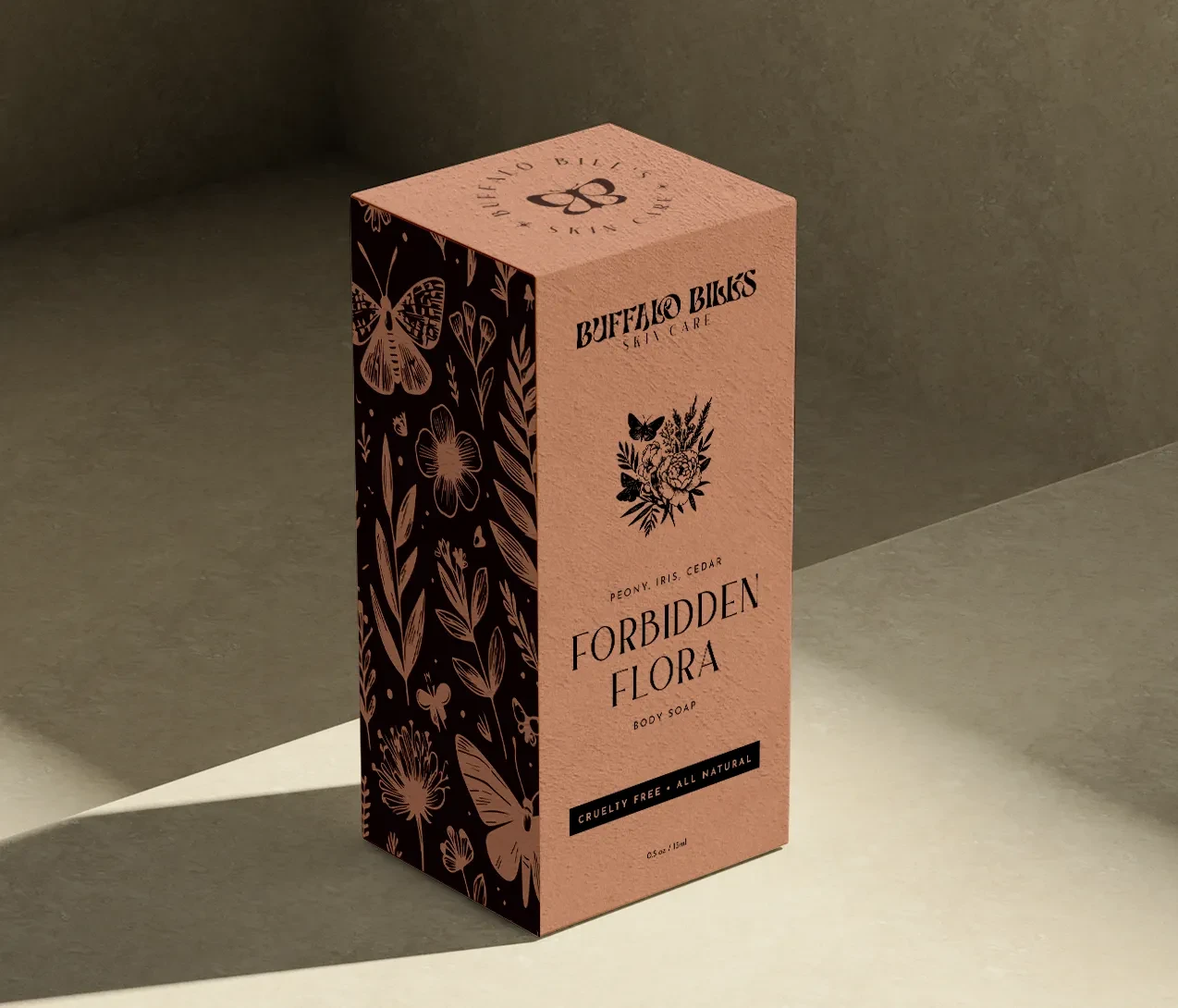
To ensure Buffalo Bill’s reflected its ties to nature and felt distinctive, I incorporated earthy tones and organic textures throughout the visual identity. The packaging includes unique names, illustrations, and colors for each product to celebrate the individuality of the customers who uses them, while moths represent the transformation that comes with using great skin care.