Rise and Shine Coffee & Donuts
This brand aims to be a ray of sunshine in everyone’s day by offering donuts in-store and coffee they can enjoy in shop or brew at home.
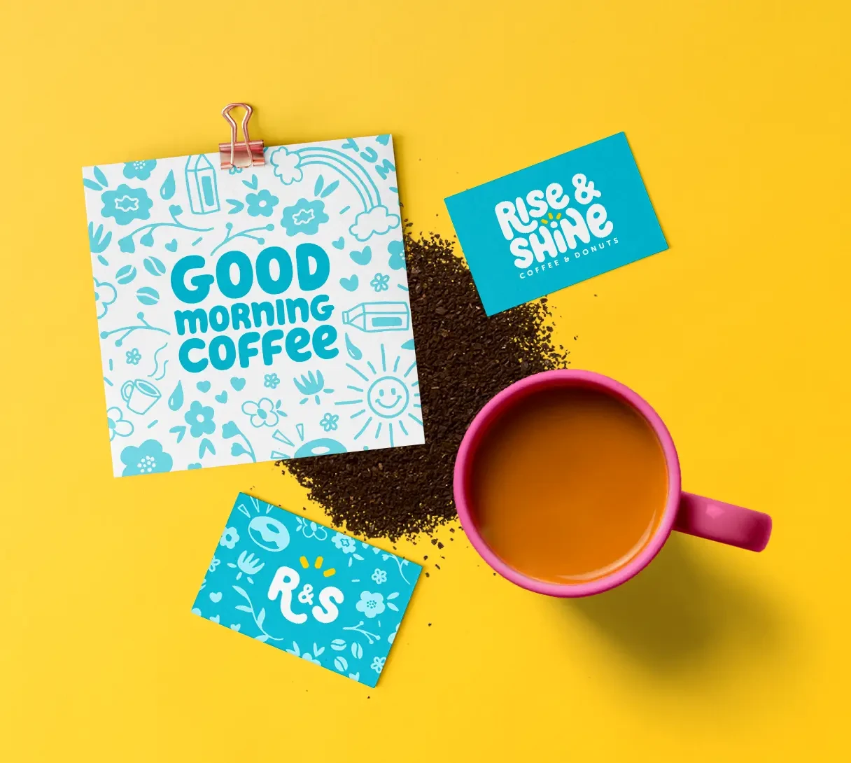
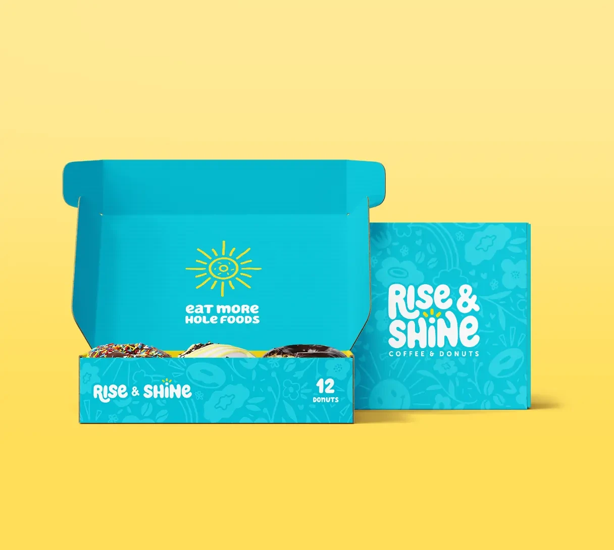
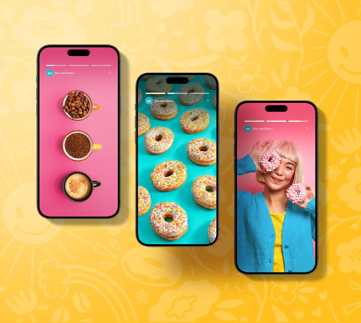
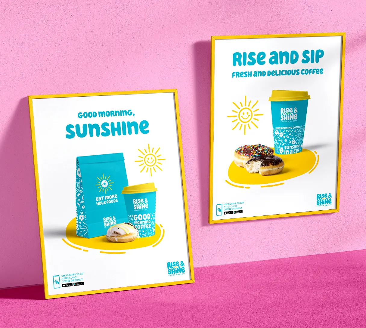
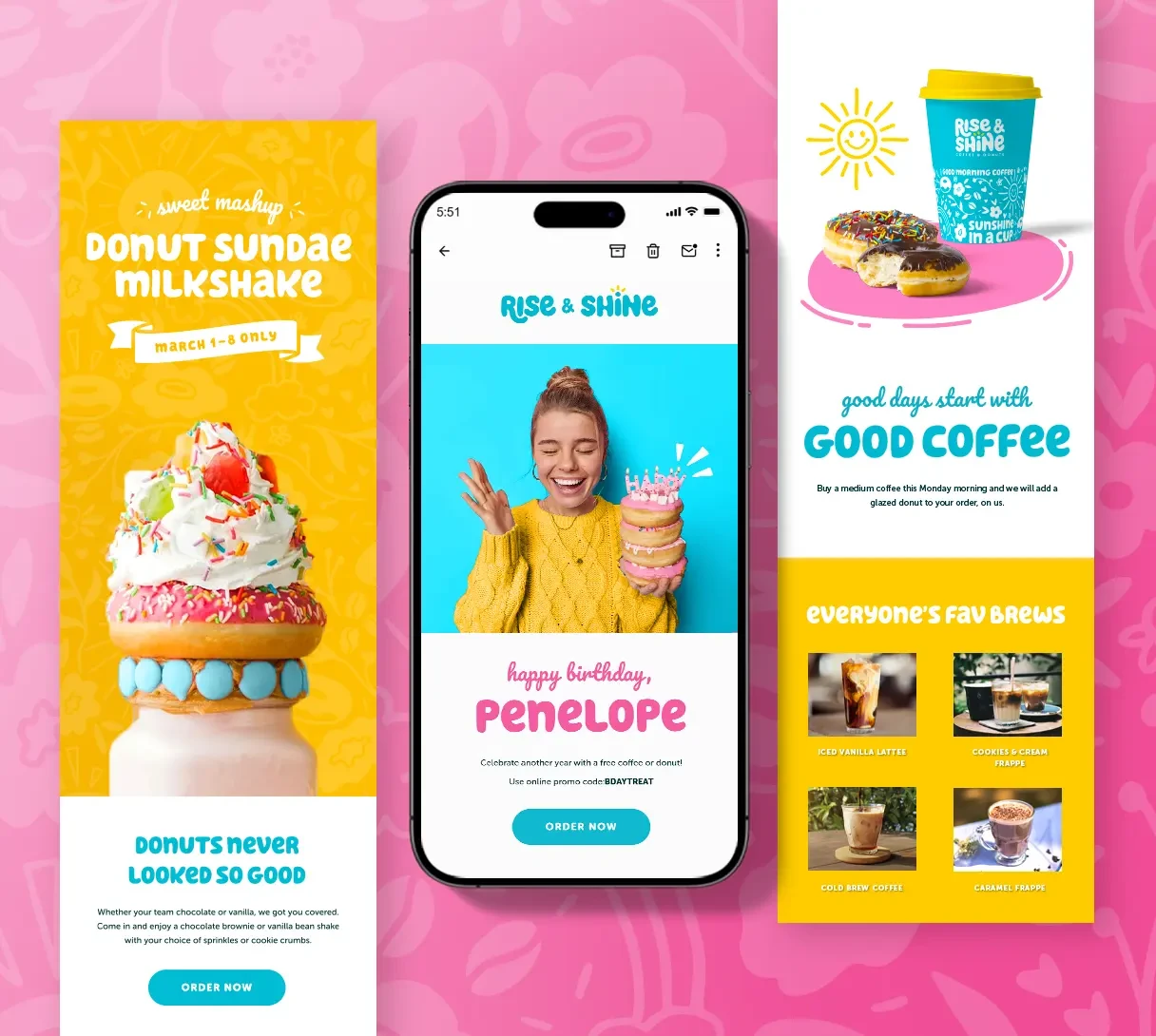
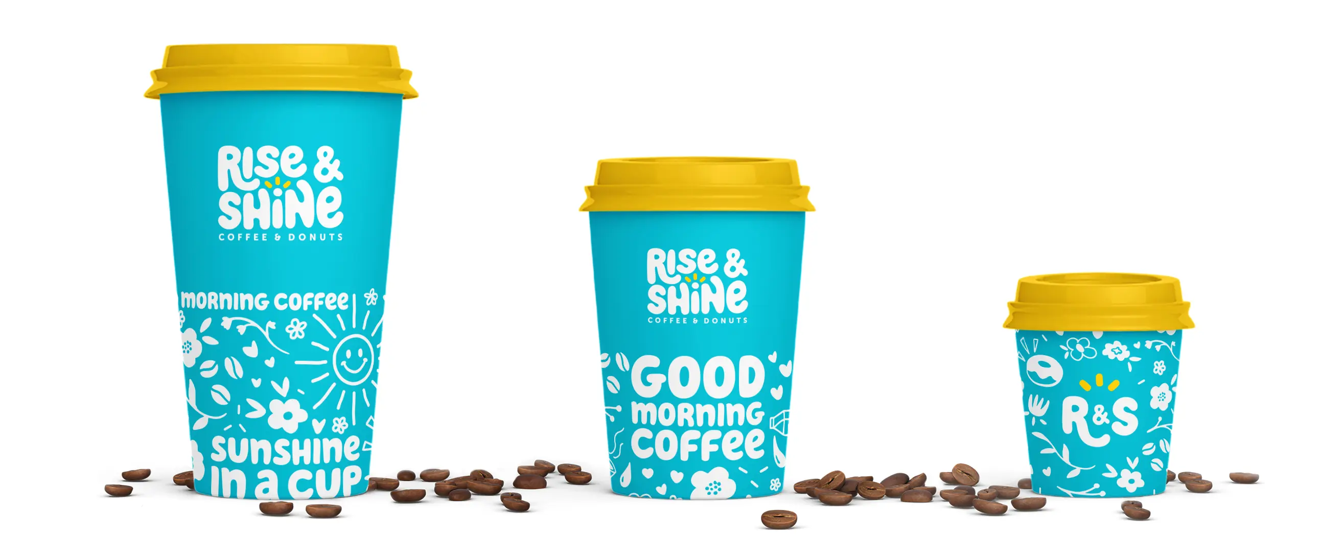
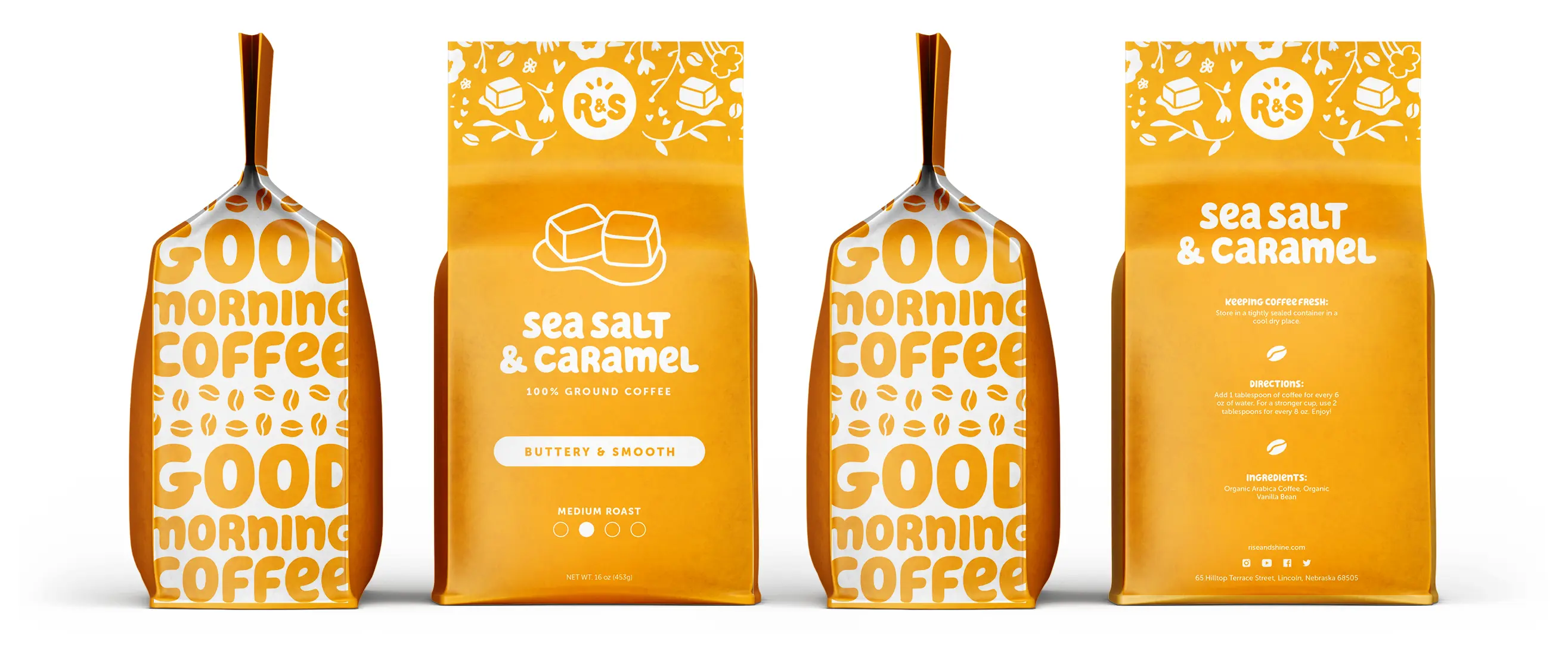
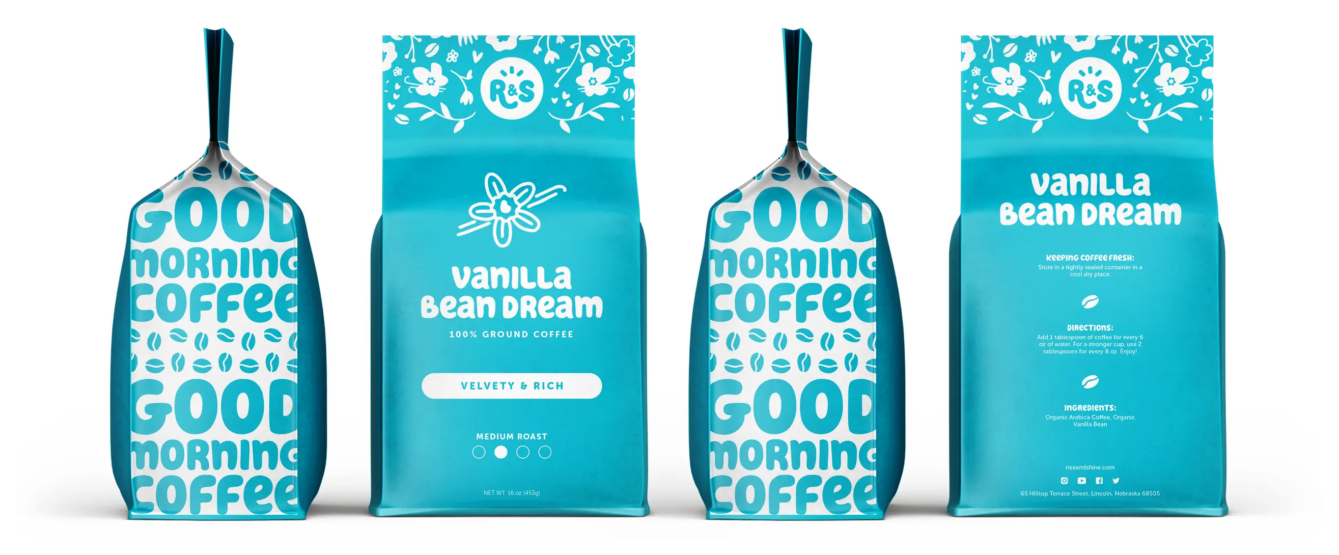
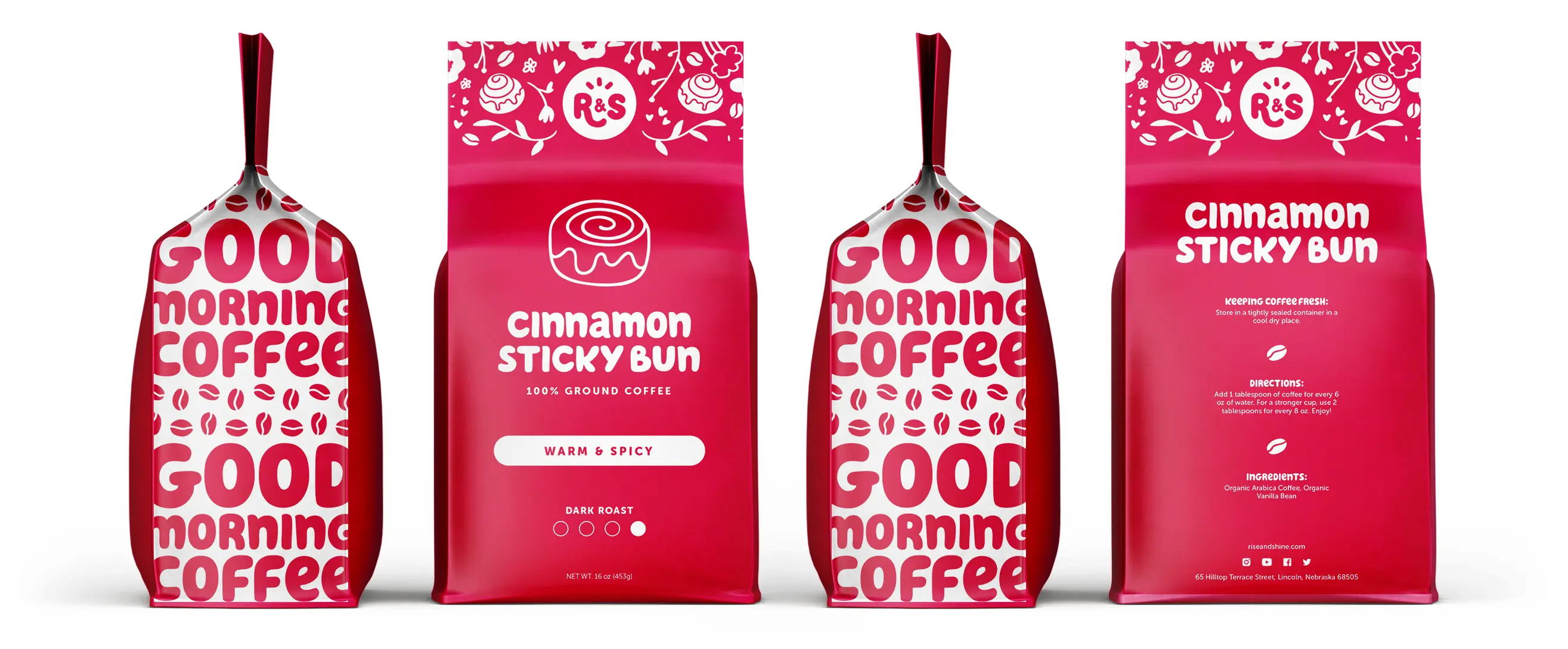
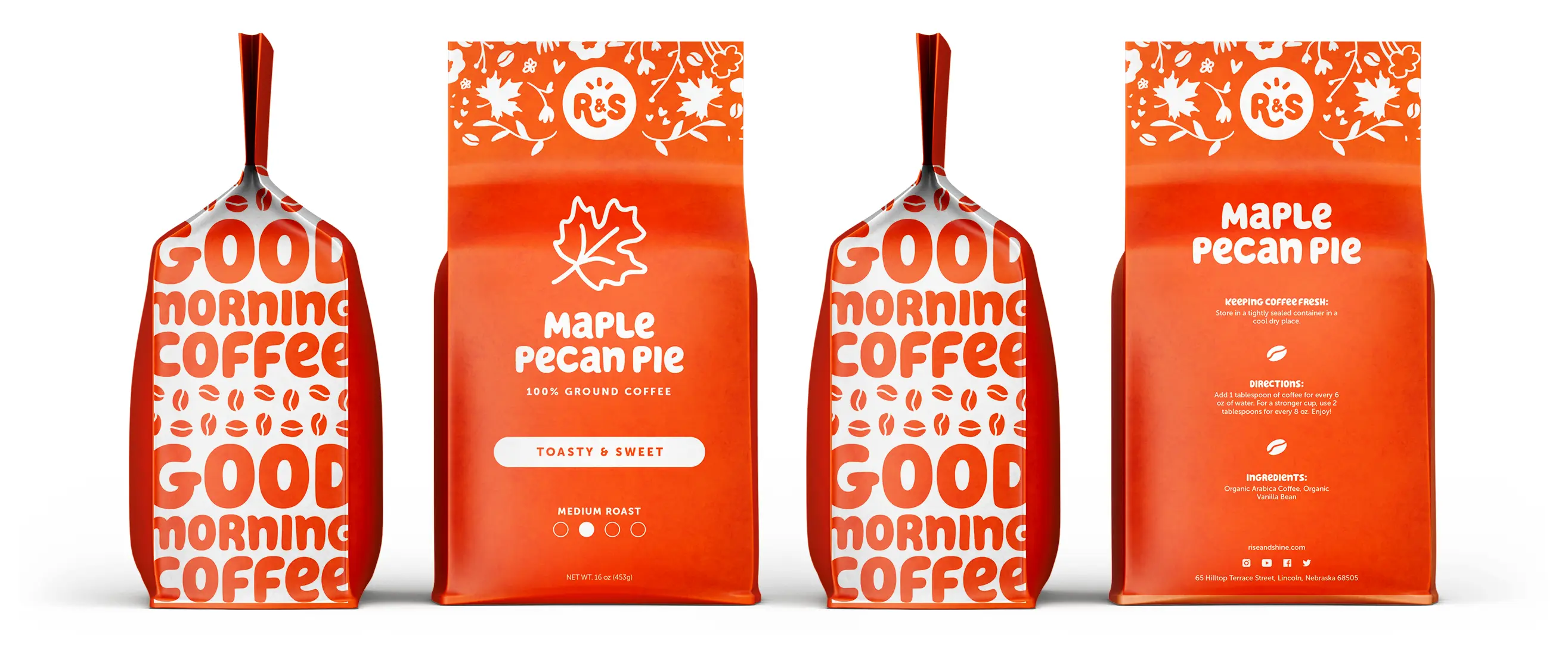
To bring their vibrant personality to life, I used a sunny yellow paired with sky blue as the primary colors to represent a clear and warm day. The main bubble-lettered font was picked to represent rising dough, as well as give the brand a friendly feel. I also created energetic illustrations for the packaging and added puns to the marketing that are meant to be uplifting and fun.


Logo Design
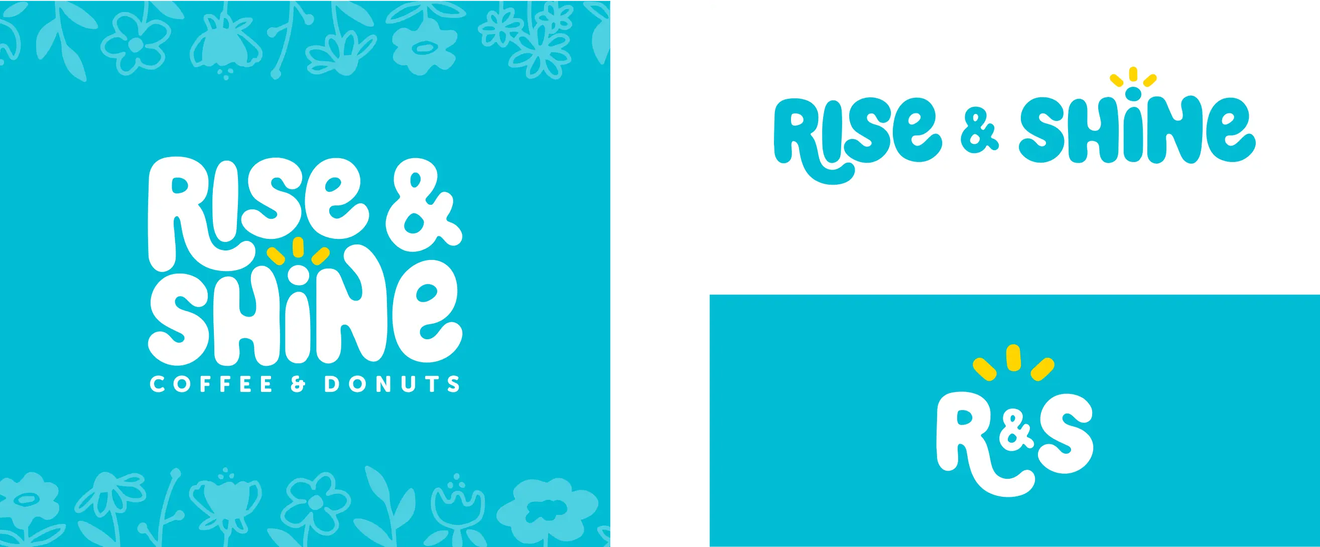
To add warmth to the logo, I designed the center of it to have yellow beams that represent rays of sunshine, around which the letters form. The "H" and "N" look like arms stretching toward the sun, evoking someone waking up in the morning. The "R" dips down and curls up, symbolizing a rising motion.



Coffee Bag Designs
To add warmth to the logo, I designed the center of it to have yellow beams that represent rays of sunshine, around which the letters form. The "H" and "N" look like arms stretching toward the sun, evoking someone waking up in the morning. The "R" dips down and curls up, symbolizing a rising motion.
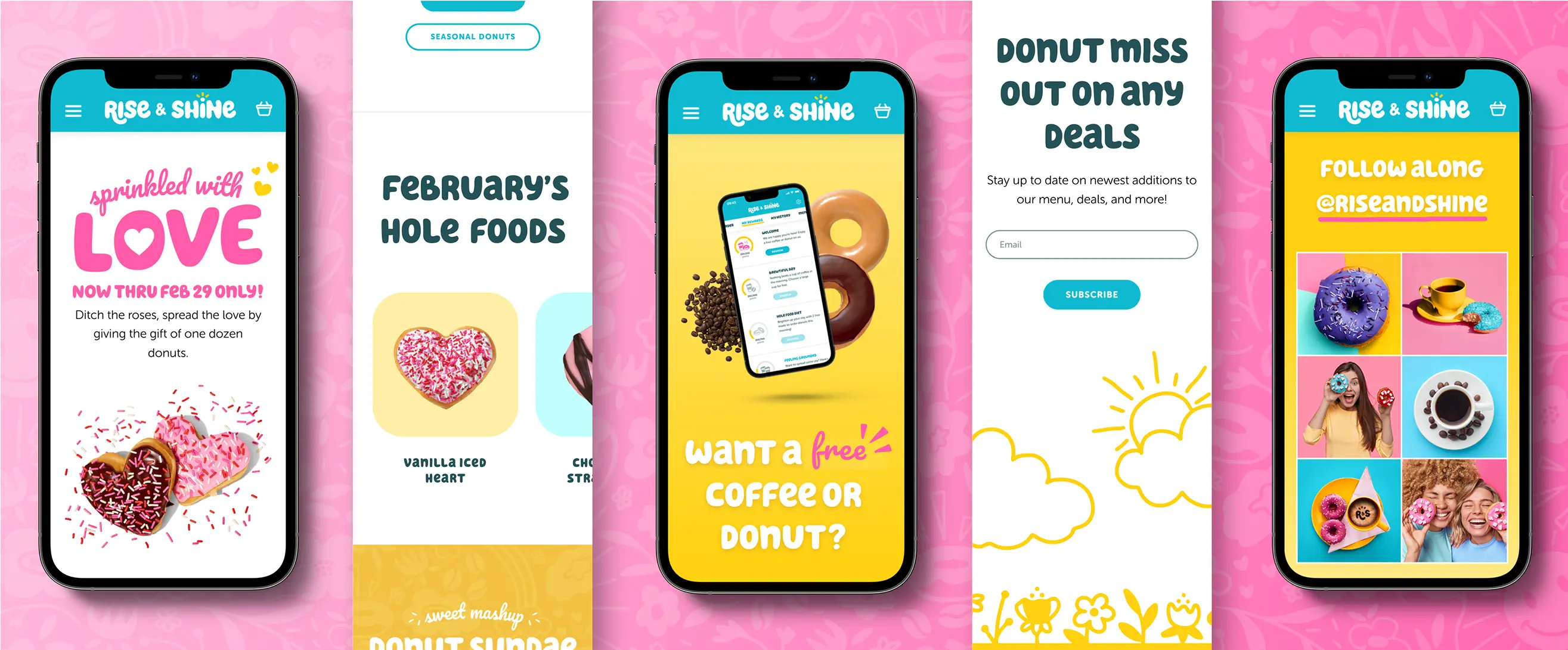
Responsive Landing Page
The main goal of this landing page is to help customers order online effortlessly, promote their rewards program and app, and encourage customers to connect with the brand on social media or through their newsletter.
