Henry's Honey
This honey brand prides itself on blending natural ingredients with ethical practices to create a high-quality product that is made with love.
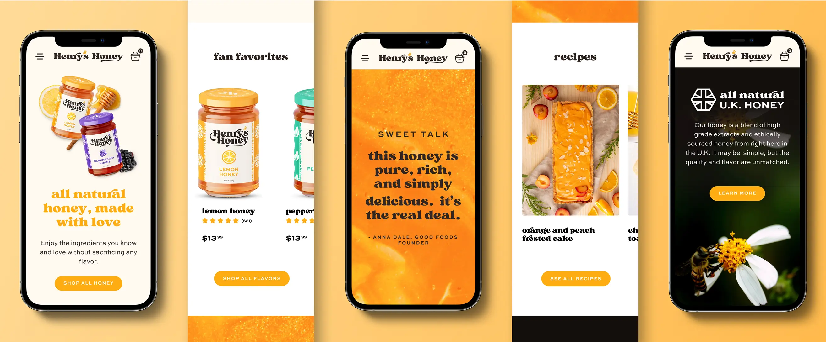
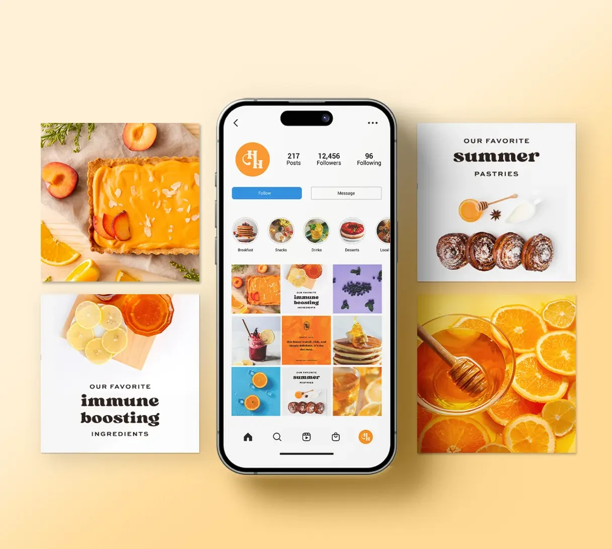
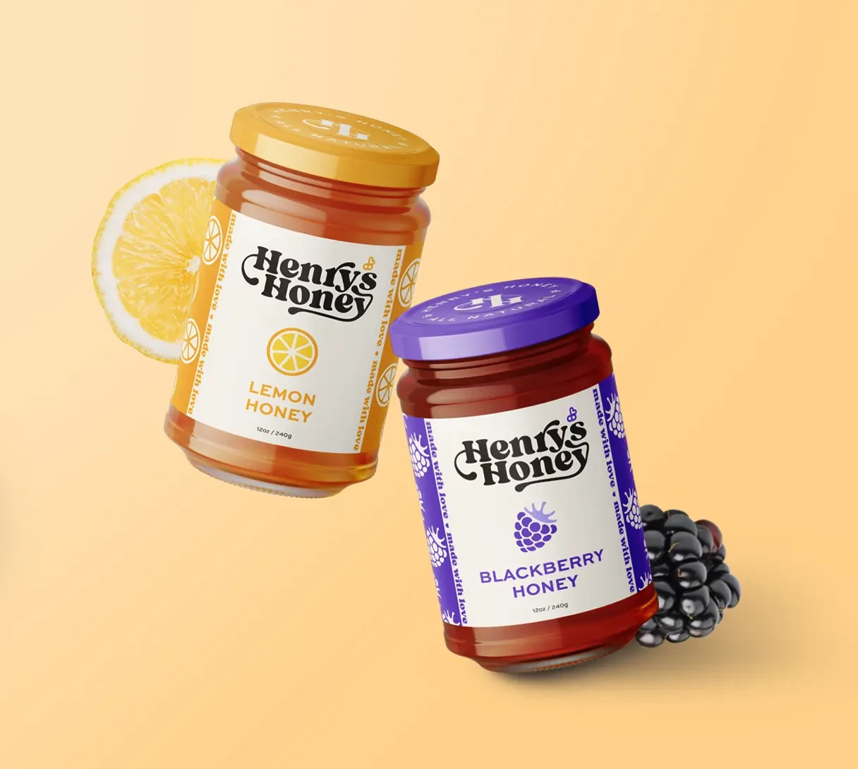
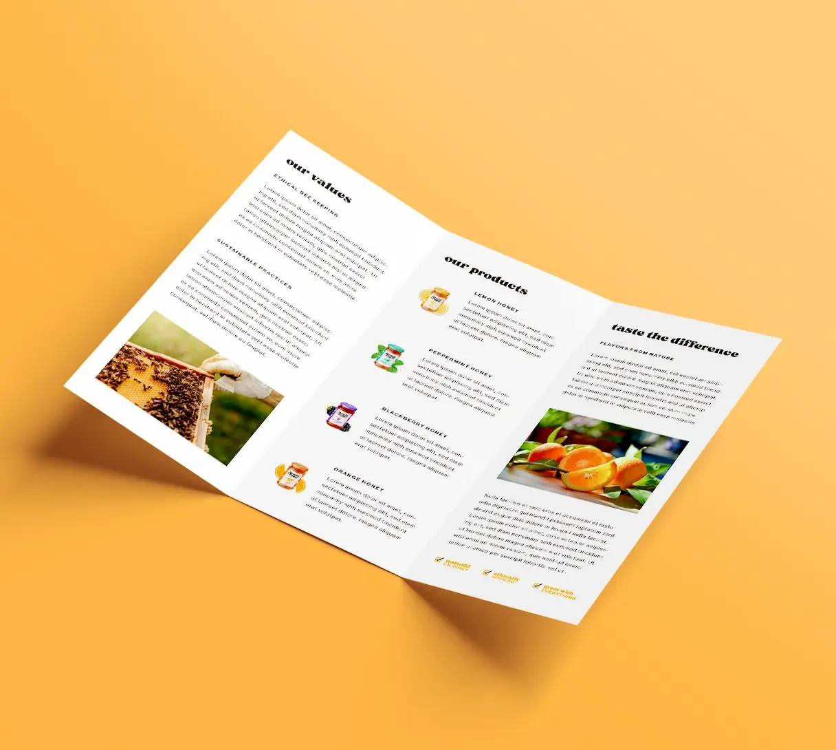
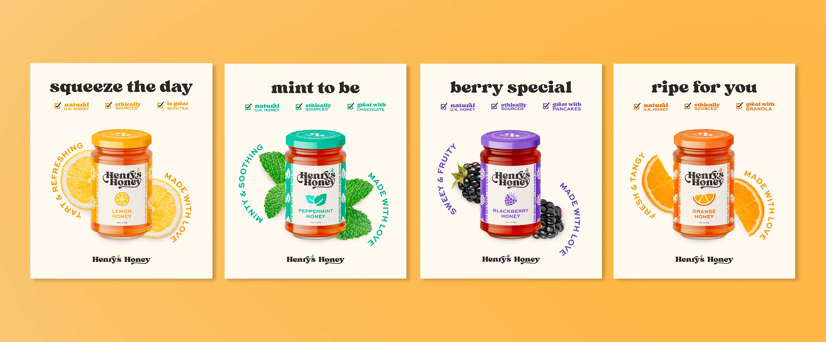
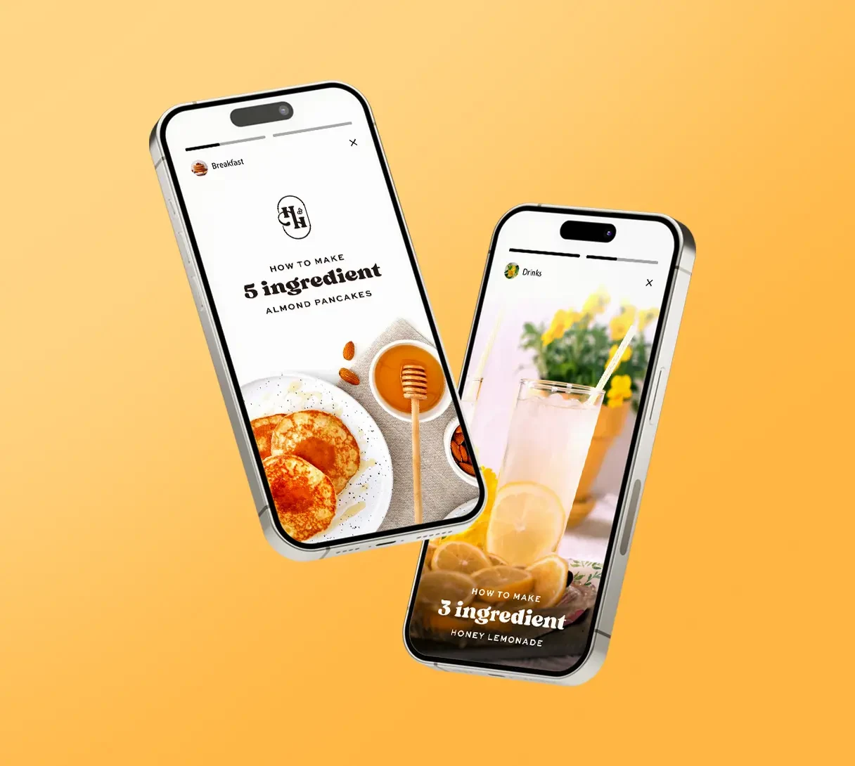
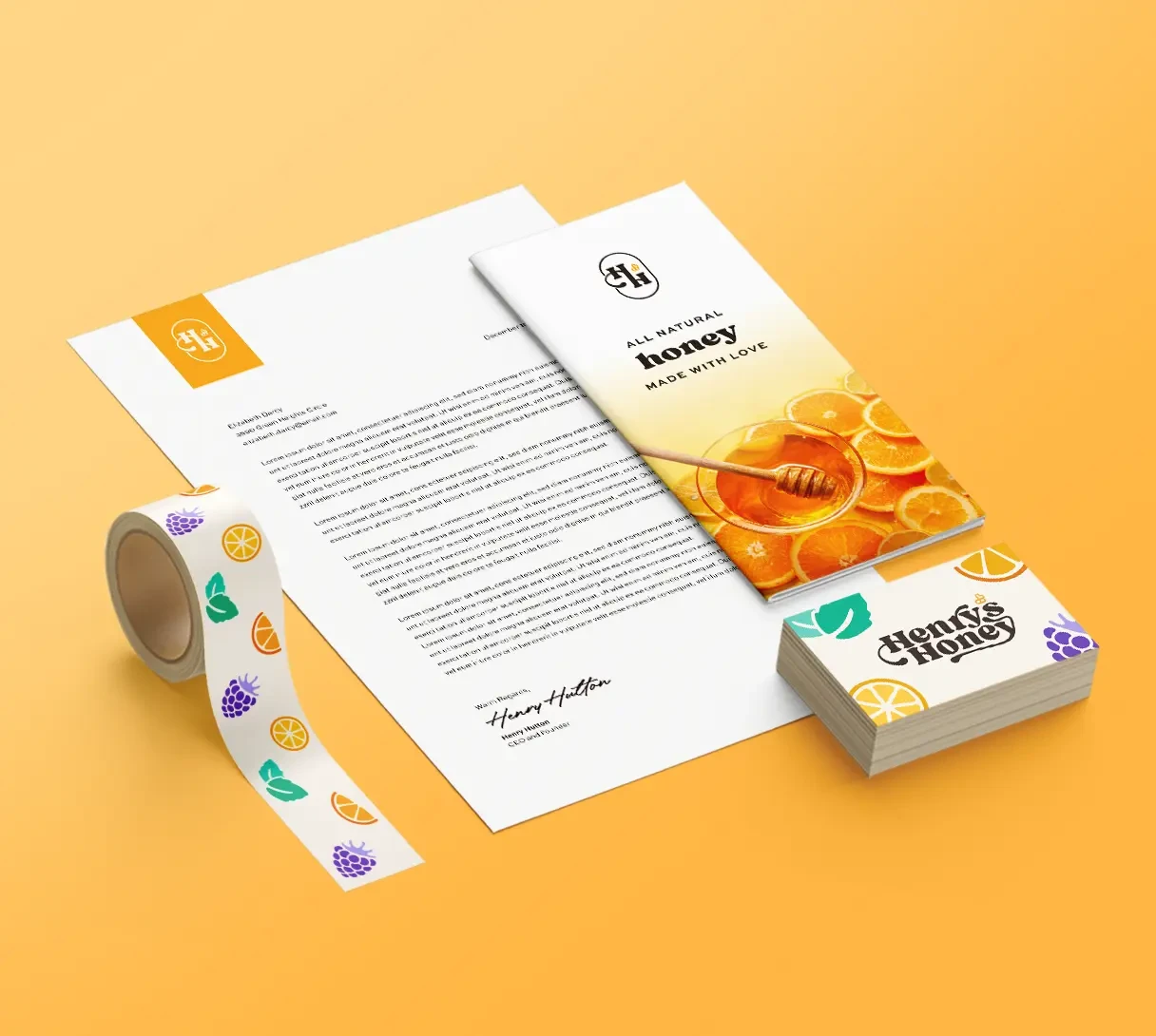
To convey the clean and simple ingredients they use, as well as make them feel modern and friendly, illustrations that utilize white space are used on the labels and a warm yellow and beige are the main colors. To make it feel a bit lively, I added play-on-words in some of the marketing and each package includes their “made with love” motto.
Logo Design
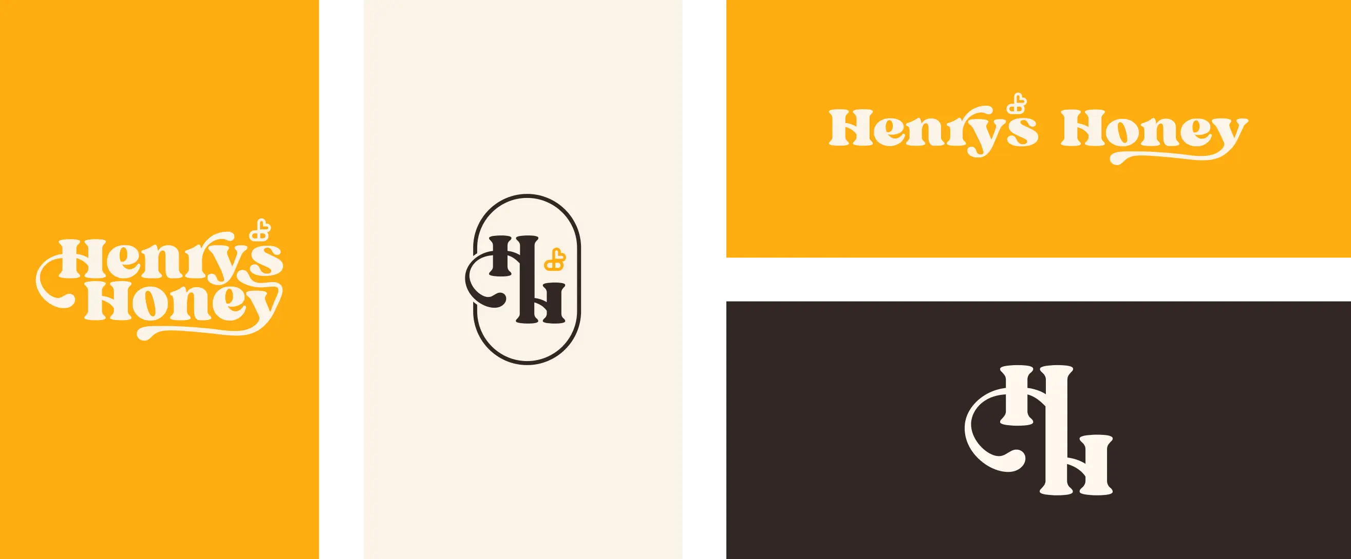
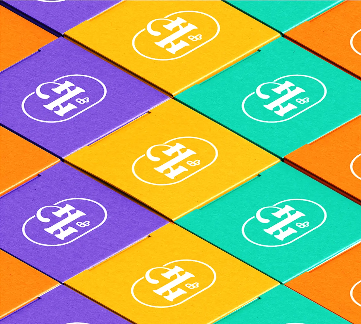
To make the logo feel playful and trendy, I used a contemporary font and added honey droplets. Additionally, I replaced the apostrophe in the logo with a bee symbol, alluding to the “made with love” message by making the wings the shape of a heart.
Label Designs
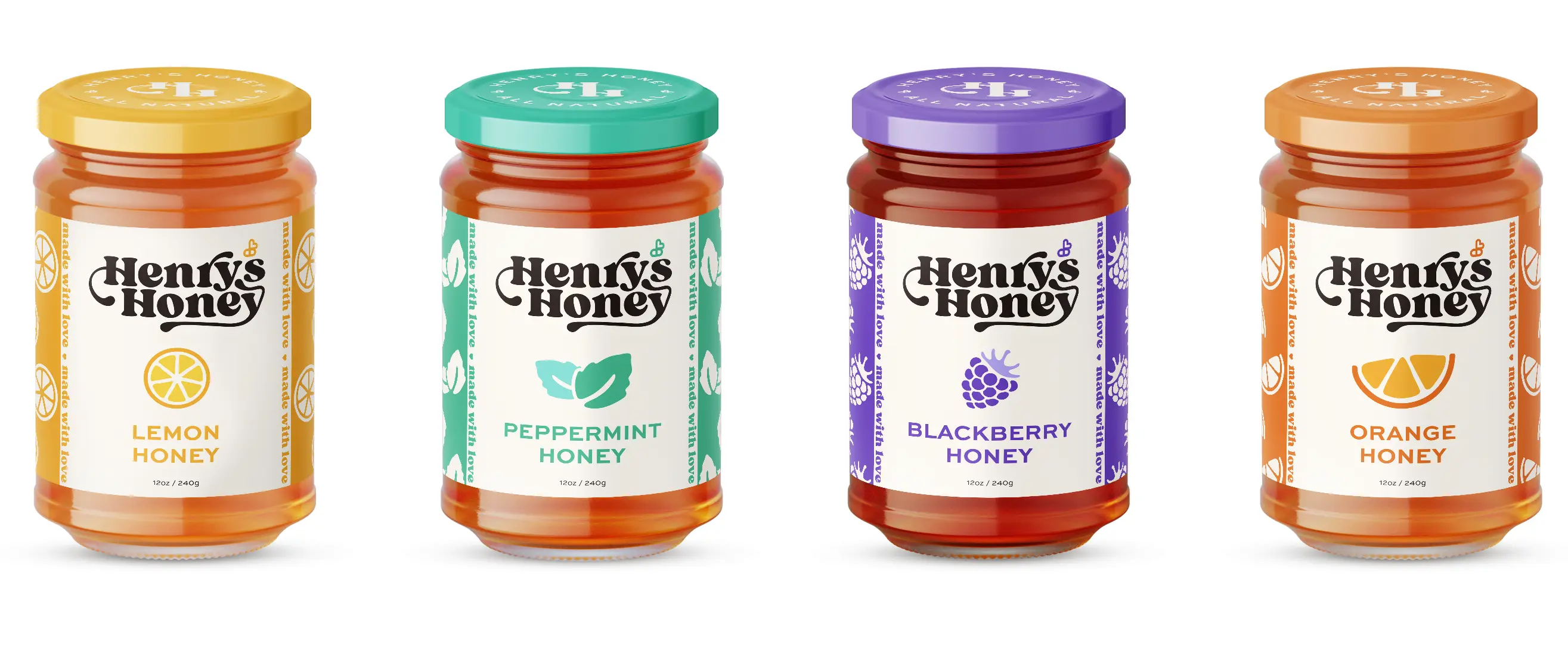
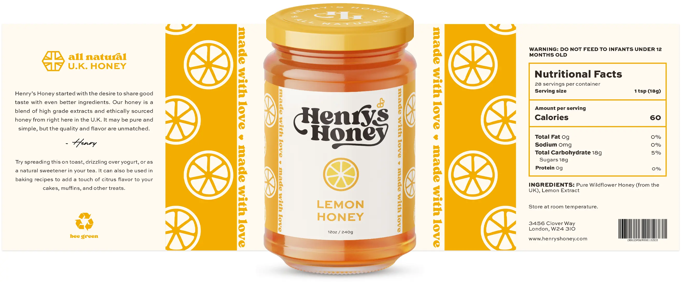
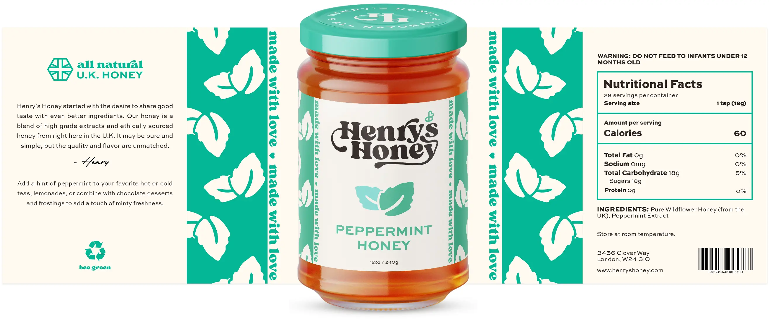
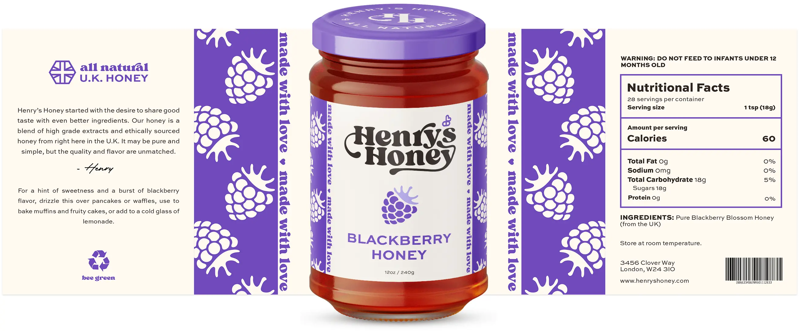
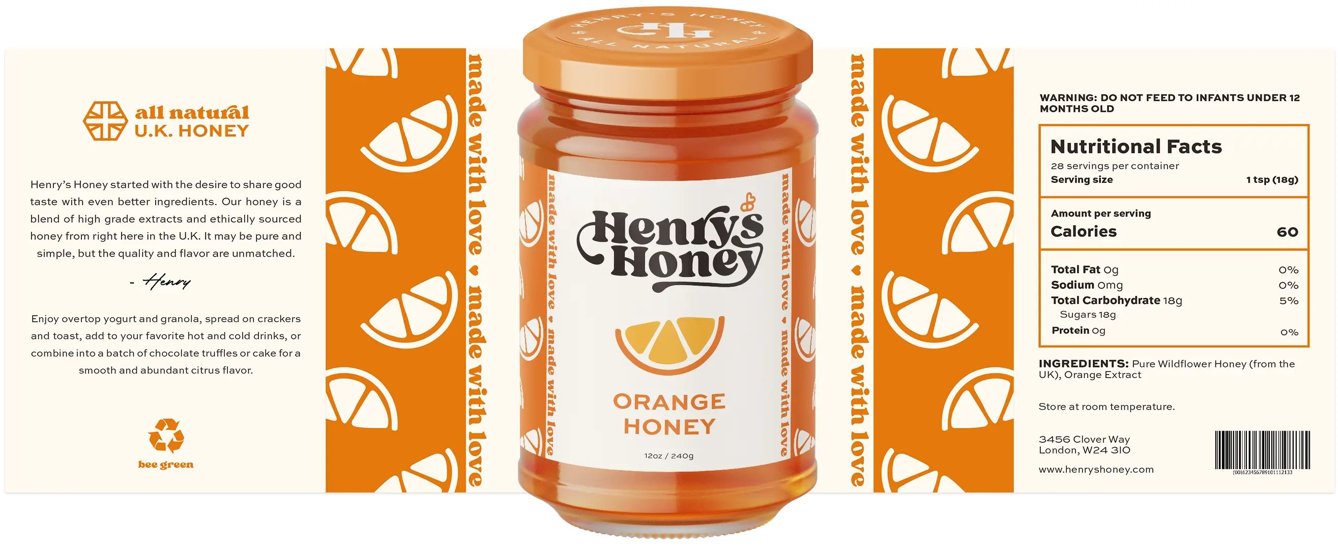
Their competitor's packaging lacked variety among different flavors, so I decided to emphasize this aspect to make the labels stand out. Each flavor is represented by its own illustration and color while maintaining a consistent look.
Responsive Landing Page
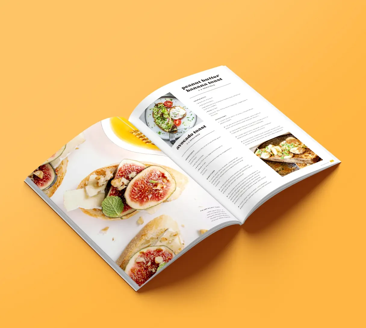
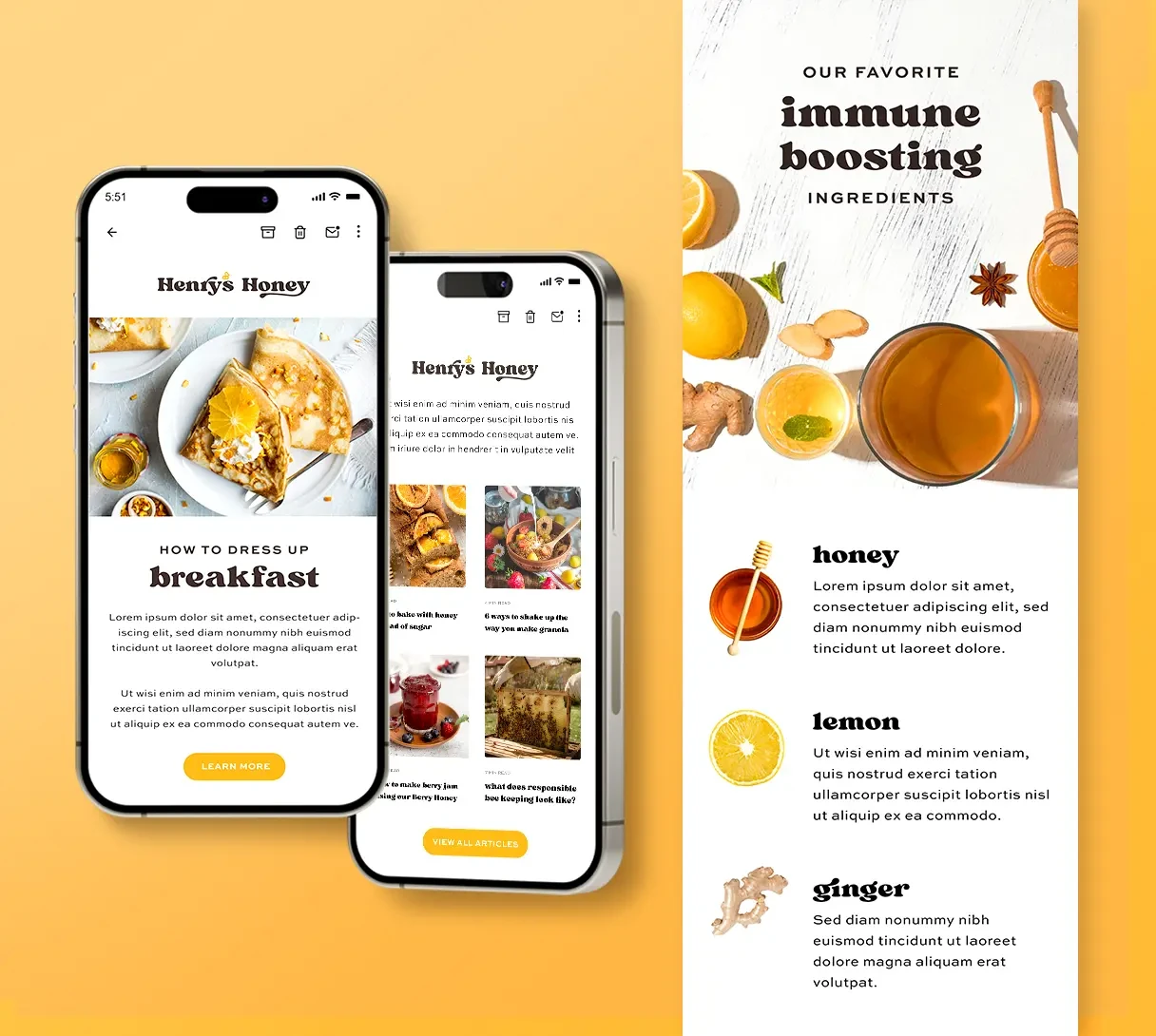
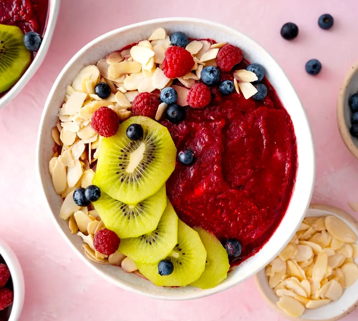
The mission of this landing page is to encourage people to buy their honey, discover creative ways to use them, and learn about sustainable practices and healthy living.
